Clover
Art Direction, Branding, Packaging DesignAccording to one recent research, there is a rise in cases of syphilis, chlamydia, and gonorrhea among 45-to-64-year-olds in the U.S. and the U.K. The reason for the rise of the S.T.D rate among this demography is that most of them grew up with abstinence-based sex education. The lack of awareness of safe sex put their health in danger.
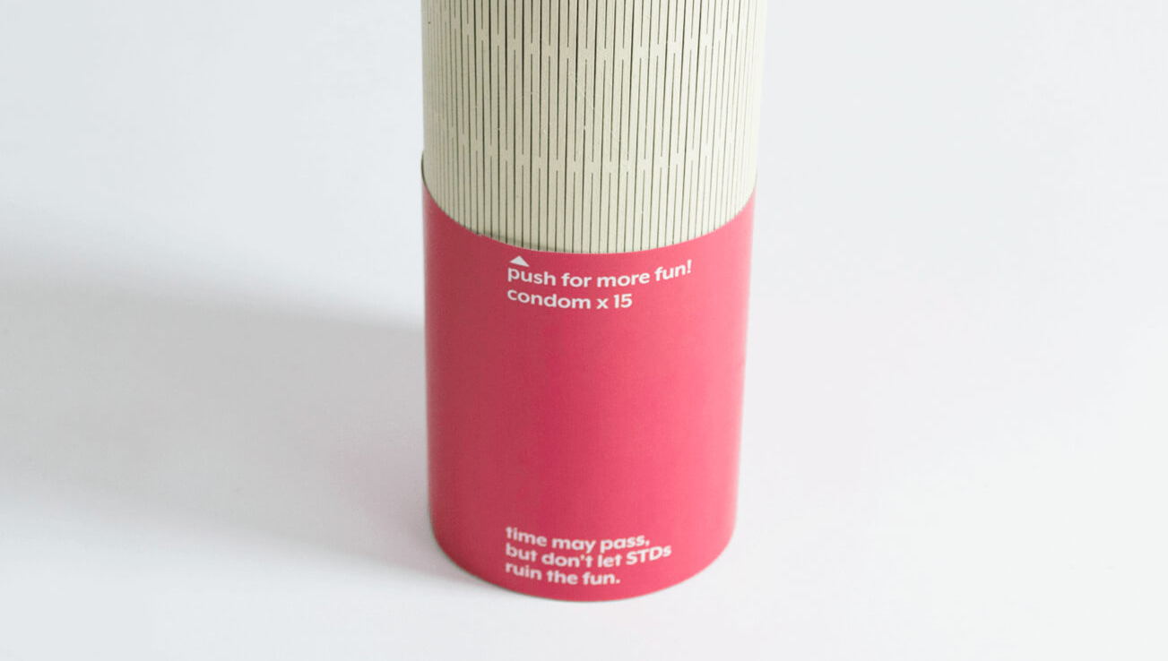
Therefore, Clover, a monthly condom subscription service designed to be user-friendly to the elderly, was created to help solve this problem.
Therefore, Clover, a monthly condom subscription service designed to be user-friendly to the elderly, was created to help solve this problem.


To create a less sexual and yet sensual narrative, I highlighted the word “lover” in the name to imply sex in a way that makes the elderly feel more comfortable about sex education. In order to connect the graphic and the brand name, “c” is purposefully designed as a part of clover leaves.


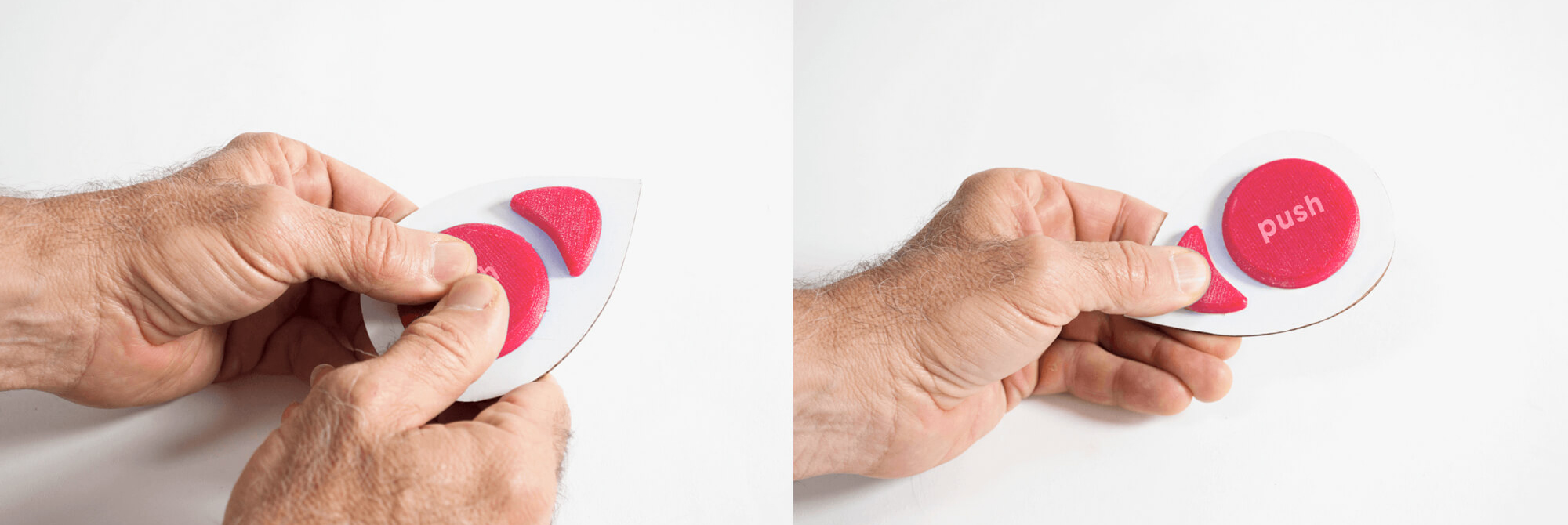
Each condom packet is divided into two sections: the bigger one for a lightly lubricated condom, the other for lube. Users can squeeze the extra lubrication side to pop the dividing seal and coat the condom with more lubricant. If the user prefers a less lubricated feel, simply push the condom side and it will come out from without breaking the dividing seal.